Draw a Cartoon House with Creative Confidence
Loose sketches, playful watercolors, and a few telling details turn a real house into a characterful cartoon—practice observation, then interpret with courage.
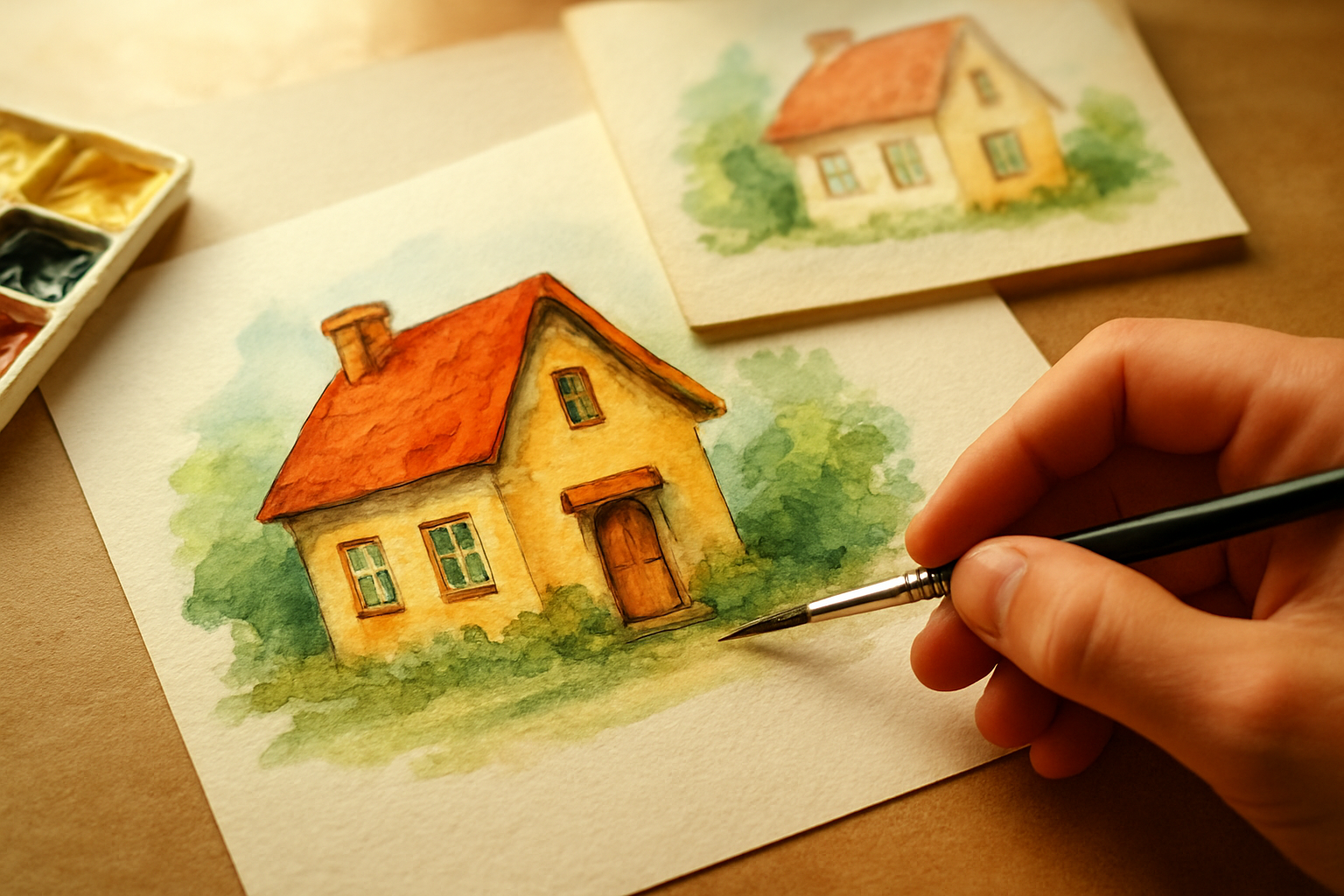
What unites sketching, watercolor, and detail work?
At the center of these techniques runs a single thread: interpretation. We don’t merely copy; we translate. A line becomes personality. A wash becomes mood. A crooked chimney becomes a story beat. When we treat a building as a subject worthy of interpretation, the technical and the spiritual meet: our hands practice craft, our imaginations practice freedom.
This is practical faith for the studio as much as the sanctuary. Learn to see what’s essential and to accent it—hold what matters and release what doesn't.
How can sketching from real-life structures improve your drawing skills?
Begin by walking around the house you want to draw. Don’t rush to measurements. Look for silhouette first—the big shapes that define a structure’s personality. Is the roof steep and proud? Is the porch low and inviting? Capture those gestures quickly with light, confident strokes.
The purpose of sketching from life isn't photorealism; it's training your eye. By observing proportion, rhythm, and negative space you develop an internal sense of balance that no ruler can teach. Try drawing the same house three times in rapid succession—each time exaggerating one feature: the chimney, the front door, or the fence. You’ll notice your hand becomes bolder, your decisions clearer, and your visual vocabulary richer.
The Heart of It: Practice first in broad strokes, then refine.
Behind the Words: Large shapes guide every informed detail and prevent overworking. Getting the silhouette right saves hours of fiddling.
Try This: Start every study with three big masses—roof, body, and foreground—and build details only after those read well.
Behind the Words:
"I praise you because I am fearfully and wonderfully made; your works are wonderful, I know that full well." — Psalm 139:14
That psalm is a king reflecting on God's intimate knowledge of human life; it roots creativity in the dignity of being made. David's original setting is personal wonder—an inward recognition that God crafts with intention, not accident.
The Heart of It: Our creative observation is an echo of God's attentive making: noticing, shaping, valuing.
Try This: Picture a rainy afternoon on a porch swing. Trace the eaves and notice how the rain gathers at one corner—exaggerate that drop, make the gutter tilt like a tired eyebrow. The house isn't wrong when it's imperfect; it's expressive.
A common misunderstanding is to think that sketching from life requires slavish copying. It doesn't. The goal is to learn the rules by seeing them, so we can later bend them with purpose.
Practical steps from life to page:
- Walk and sketch: five-minute gesture sketches to capture rhythm and movement.
- Block-in method: use ovals and rectangles to map roofs and walls.
- Note textures: the rhythm of shingles, the gap between fence posts, the slope of a path.
When you pay attention to shingles, shadowing, and landscaping elements you give yourself a library of marks to pull from later. Those marks are not trivia; they are vocabulary—tiny accents that reveal age, weather, and care.
What watercolor techniques add depth to cartoon house drawings?
Watercolor lends mystery and warmth without fighting the ink or pencil beneath it. It responds to water, pigment, and gravity—three partners that make happy accidents possible. Use watercolor to suggest material, light, and mood quickly; that's why many artists choose it for cartoonized architecture.
Begin with a limited palette. Pick three harmonizing colors: a warm earth for roofs, a muted green for landscaping, and a cool gray for shadows. Mix them in small puddles and test on a scrap of the same paper. Watercolor is about ratio—more water, more glow; more pigment, more presence.
Try a light wash for the main plane of the house, letting pigment flow unevenly so walls gain subtle variation. For shadowing, use a cool, diluted mix and drop it into the wet wash (wet-on-wet) so edges feather. For crisp edges—like window frames—dry the paper and paint with concentrated pigment (wet-on-dry). These two modes—wet-on-wet and wet-on-dry—are your main tactics.
The Heart of It: Let the medium do some of the work.
Behind the Words: Watercolors reward trust and gentle control; they don’t tolerate an over-controlling hand but respond beautifully to intention.
Try This: Reserve strong pigment for the focal point—maybe the front door. Let the rest breathe in softer tones.
A hard saying from drawing practice frees as it stings: emphasize creativity over perfection in art. If we chase technical flawlessness above expression, our work becomes flatter—sterile even. Perfection can become a god that steals joy. When we prioritize creativity, we reclaim the playful wideness of making; we allow mistakes to become texture and read surprises as meaning, not failure.
Practical watercolor tips that honor creativity:
- Scrub out highlights with a damp, clean brush while the wash is still damp—this creates sunlit spots quickly.
- Use a dry brush to suggest rough shingles or clapboard texture; drag bristles sideways for grain.
- Lift pigment with a tissue to create faded paint or sun-bleached spots.
To age a wall, glaze a thin yellow-brown over a dried wash. For moisture and mood, drop a granulating pigment into a damp shadow and watch it settle like dust. Artists use watercolors for shading and enhancement precisely because they give life without clumsy opacity.
Finally, remember: testing is faithful. Keep a practice sheet where you record what each mix does; names like "roof brown A" and "porch shadow B" will save you time and anxiety during a larger piece.
How do details change a cartoon house from flat to characterful?
Details are punctuation marks in a drawing. They tell who lives there, what the seasons have done, and how time has shaped the place. A crooked shutter can speak of a hurried repair. A patch of wildflowers suggests a gentle gardener. Little choices—an askew welcome mat, a stack of firewood, a string of mismatched lightbulbs—turn structure into neighbor.
Begin by deciding the voice of your house. Is it whimsical, melancholic, proud, or tired? Then choose three detail types that support that voice: architectural accents (shutters, trim, eaves), human traces (mailbox, toy, bicycle), and environmental markers (ivy, moss, pathways). Place them deliberately, not everywhere; restraint amplifies meaning.
The Heart of It: Details should support a unified character, not clutter it.
Behind the Words: A few meaningful marks read more clearly than a scatter of random ornaments.
Try This: Pick three signature details and repeat variations of them across the composition.
Behind the Words:
"Whatever you do, work heartily, as for the Lord and not for men," — Colossians 3:23
Paul wrote to a first-century church facing pressures to please many masters; his exhortation grounds daily work in devotion. The original setting was pragmatic—how Christians should behave in households and workplaces—yet the line carries over to creative labor today.
The Heart of It: Small acts of careful making are not minor; they’re opportunities to practice devotion and stewardship.
Try This: Imagine a Saturday morning with sunlight cutting across your table. Add to your house a sagging mailbox and a pair of muddy boots by the stoop. Give the mailbox a tiny sticker with a faded heart. Step back: the house reads as lived-in, loved, and a little worn by kindness.
A frequent mistake is thinking every visible surface must be worked into hyper-detail to look "finished." Careful absence—intentional emptiness—can be as powerful as a flourish. Leave some spaces to let the eye rest; that silence is part of the composition.
Practical ways to build character:
- Use line variation: thicker lines for foreground trims, thinner for distant shingles.
- Layer story clues: a child's chalk drawing on a step, a leaning ladder, a faded welcome sign.
- Combine media: ink for crisp edges, watercolor for mood, and a colored pencil for final highlights.
Drawing with others and showing family and friends invites fresh eyes. When someone asks, "Why is the chimney crooked?" you’ll have an answer: "Because someone once sat on the roof and loved the house so much they left it slightly imperfect."
From sketch to sanctuary: bringing it all together
When sketching from life, use broad shapes to find the house’s voice. When you add watercolor, let the medium suggest light, age, and weather. When you place details, choose marks that tell a story rather than fill space. The rhythm between these steps is where learning happens: observation, translation, and interpretation.
You don’t need every tool. A simple kit—sketchbook, a box of watercolor pans, a brush, and a trusty pen—will take you far. Try a morning of location studies and an afternoon of studio finishing. Allow a day or two between the first sketch and the final color; distance helps decisions.
Some final encouragement: art is an exercise in vulnerability. We show our work and risk judgment. Yet every drawing is also a small offering—an honest attempt to see and to make. Experiment: flip a roofline, invent a window, and let a washed shadow speak of a memory. As you practice, you train both your hand and your heart.
Pick one house—real or imagined—and give it a defining gesture. Watercolor that gesture and add a single, telling detail. Share it with someone whose opinion you trust. Celebrate the wobble and the wonder when it arrives.
Key Takeaways
- Practice drawing from real life to develop skills.
- Emphasize creativity over perfection in art.
- Explore shading techniques to create depth.
- Experiment with different artistic styles.
- Share and celebrate your artwork with others.
Notable Quotes
"I hope you guys are enjoying this one and experiment on your own type of a house and your style and bring it to life."
"It's a key thing when you're doing these lessons."