Contrast & Shading: Bring Cartoons to Life
Learn practical ways contrast and shading turn simple sketches into lively cartoons—turn a pumpkin into a fish with readable silhouette, texture, and movement.
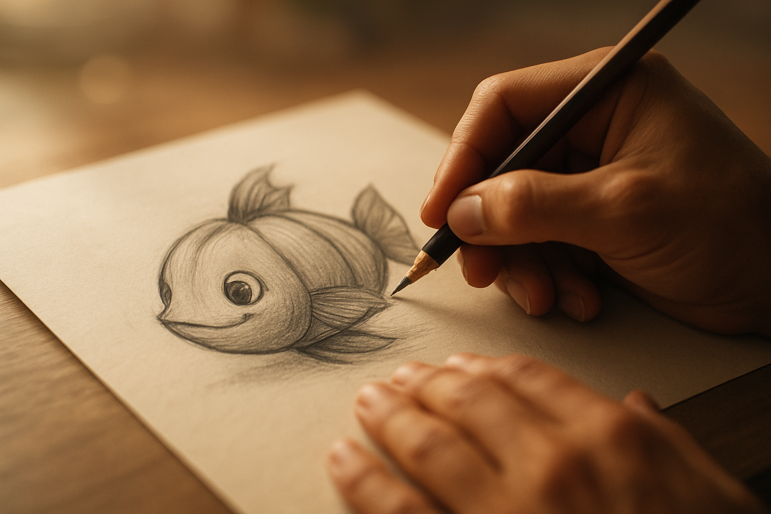
How contrast changes a simple cartoon
Contrast isn’t decoration. It’s the signpost that says, “Look here.” In a cartoon, strong contrasts tell your viewer which shapes belong to the character and which belong to the background, which parts recede, and which parts glow. That’s why a playful design like a jack-o'-lantern fish depends on clear separation between dark recesses and lighter faces.
The Heart of It: Contrast clarifies story, not just aesthetics.
Behind the Words: When you darken the inside of a carved mouth or make one eye slightly darker than the other, you’re not just shading—you’re assigning focus and meaning. This echoes John’s prologue about light entering the world as revelation amid darkness: the artistic truth is similar. Light and darkness act as markers, and contrast in a sketch marks what matters now.
Try This: Darken one area—perhaps the carved mouth of a pumpkin-head fish—and ask, “Does this lead the eye toward the emotion I want?” Start the darkest hole first with a soft pencil, then pull the form around it.
Even tiny differences—one heavier line, one darker eye socket—become the language your audience reads first. The hard part isn’t learning to darken a shape; it’s resisting the temptation to make everything evenly neat. When everything is the same value, nothing points the way.
That idea can be a spiritual metaphor too: if we insist everything in life be equally bright, we miss the places God uses to guide us—shadowed valleys where light looks more glorious. In practical drawing terms: mark the darkest darks and the lightest lights. Your brain will thank you.
Contrast also helps with texture. Show carved wood versus slick fins through contrast choices—short, heavy hatch marks for the pumpkin’s ribbing and softer, sweeping lines for the fish’s fin. That difference tells the viewer what to feel beneath their fingers.
Try This: Step back and squint or blur the page with your fingers. If the main forms still read, your contrast choices are working. If everything melts together, find one area and deepen it. That single decision will anchor the whole drawing.
Shading techniques that give depth to cartoon forms
Shading turns the idea of volume into believable presence. For cartoons, shading isn’t about photorealism so much as readable depth—simple cues that say, “this round thing turns away from the light.” Use shading to emphasize curvature, indicate the thickness of a pumpkin rind, or show the thin flaring of a fish fin.
The Heart of It: Shading is storytelling in value, not just in tone.
Behind the Words: Many psalms celebrate the intimate knowledge of our Maker—the image of being formed with care. When the psalmist speaks of being woven in the depths, he points to the beauty of detail, which is what careful shading honors in our craft.
Try This: Choose one light source and commit to it. Picture a sculptor’s studio: run your hand along a carved pumpkin and feel the ridges and depressions. Translate that tactile sense to pencil by using a softer lead in the deeper grooves and a lighter touch across the midplane.
A practical tip from teachers: use a softer B-style pencil for richer darks and softer gradients, and reserve harder pencils for faint guidelines. Turn the paper as you draw; the motion makes many curved strokes feel like one confident gesture rather than a nervous series of short lines.
Shading also helps resolve overlapping shapes. When a pumpkin-fin overlaps the body, shade the edge beneath slightly darker to imply depth. For cartoons, don’t overwork it—small, deliberate strokes accomplish more than layers and layers of smudging.
Technique drill: start with a mid-tone wash using light diagonal strokes. Identify the darkest plane—usually the carved interior or the shadow under the stem—and deepen it with a heavier hand. Use an eraser to lift tiny highlights on rounded surfaces; those highlights sell the volume more than any heavy shadow.
And add a simple atmosphere: underwater elements like soft bubbles or a faint shadow cast by a seaweed blade help tell where the creature lives. Let those little, airy marks hover over your shaded forms to place the character in believable space.
When a pumpkin becomes a fish: combining contrast and shading for character
There is a moment when technique becomes character. That’s the space where a pumpkin stops being plant matter and becomes someone who swims. Combine the clarity of contrast with the tactility of shading so the design both reads and feels.
Start by roughing simple shapes. Begin with the pumpkin silhouette, then add fish fins at loose gesture lines—this is rhythm before detail. Once the silhouette works, anchor the face by carving a darker mouth and eye cavities; those darks act like punctuation.
The Heart of It: A successful hybrid character reads first as silhouette, then as personality.
Behind the Words: If the silhouette confuses the viewer, no amount of internal detail will fix the read. If the silhouette is clear, contrast and shading add personality.
Try This: Test the silhouette at thumbnail size before committing to details. Use black interiors for carved features and lighter grays for the carved edges. Shade the pumpkin’s ribs so the roundness sits beside the thin translucence of fins—quick hatch lines and lighter pressure suggest fragility; shorter, heavier strokes suggest rind.
Don’t neglect background elements: simple seaweed, a few stones, or a scattering of shells ground the character. They’re not mere decoration; they give the character a home. Bubbles that drift upward—tiny circles with a subtle highlight—announce movement and create a lightness that contrasts a heavy carved mouth.
Turn the paper if a curve feels awkward. That physical trick keeps your strokes fluid and confident. When a part pleases you, say it aloud—“I like how that’s looking”—and keep moving from tentative corrections to decisive marks.
Finally, choose one finishing touch to unify the piece: a thin rim highlight along the carved edge, a tiny specular on the fin, or a darker ring around the eye. That single decision binds contrast and shading into a coherent read.
After you finish, sign the page and sit with the feeling. Did the face read from five feet away? Did the shading suggest texture without fighting the silhouette? If yes, you’ve done the hard work. If not, pick one dark and tip the balance; watch the whole drawing recalibrate.
We draw because we want to make something true on paper—an idea, an emotion, a small story. Contrast points the way; shading gives the shape weight. Together they let us turn a simple pumpkin into a living fish that breathes in our imagination.
So pick up a softer pencil, turn the paper when the curve asks for it, darken one part until it sings, and let a tiny bubble float away. We learn by doing, and every confident stroke is a small act of courage. Keep drawing, and let the light and shadow tell the next line of your story.
Key Takeaways
- Practice basic shapes before drawing complex designs.
- Focus on contrast and shading for depth.
- Use playful elements to spark creativity.
Notable Quotes
"This is going to be a fun lesson."
"Contrast is important."
"I like how that one's looking too."